Lucra
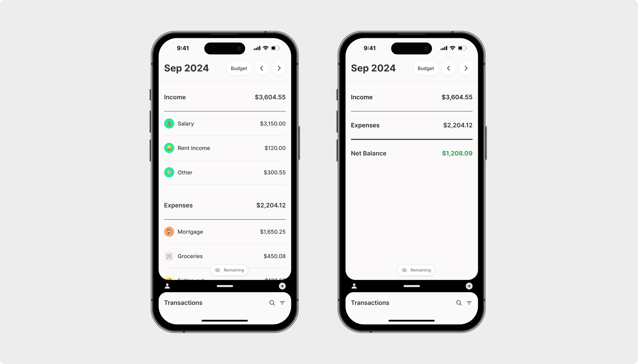
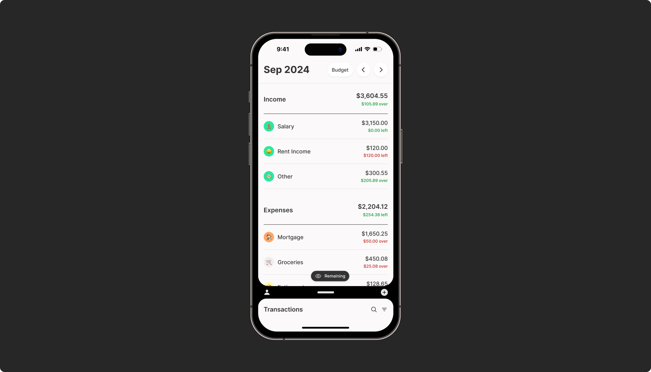
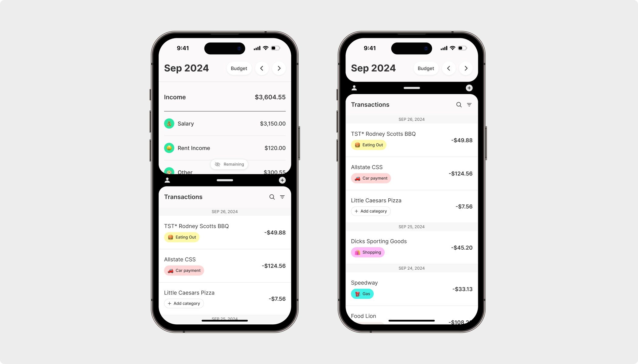
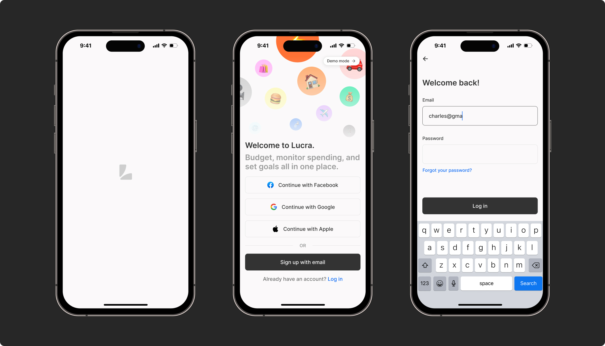
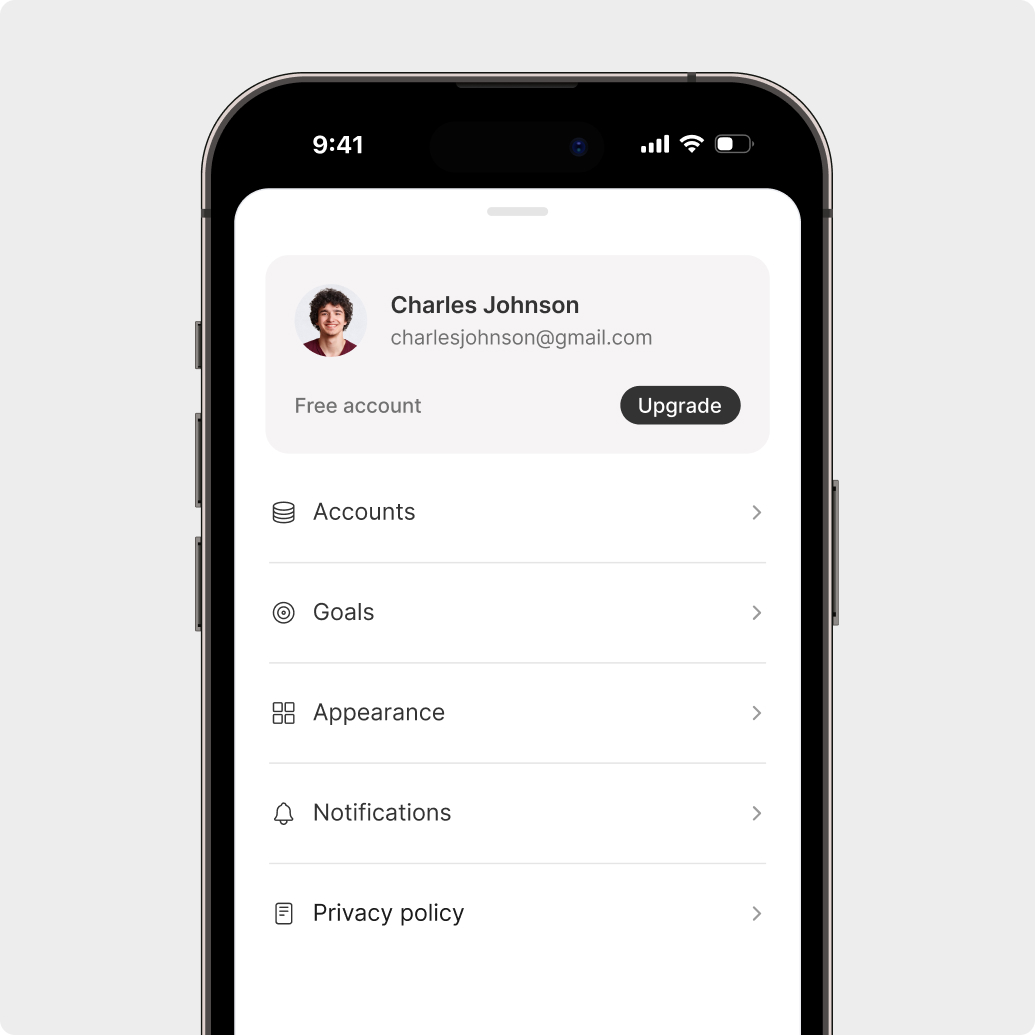
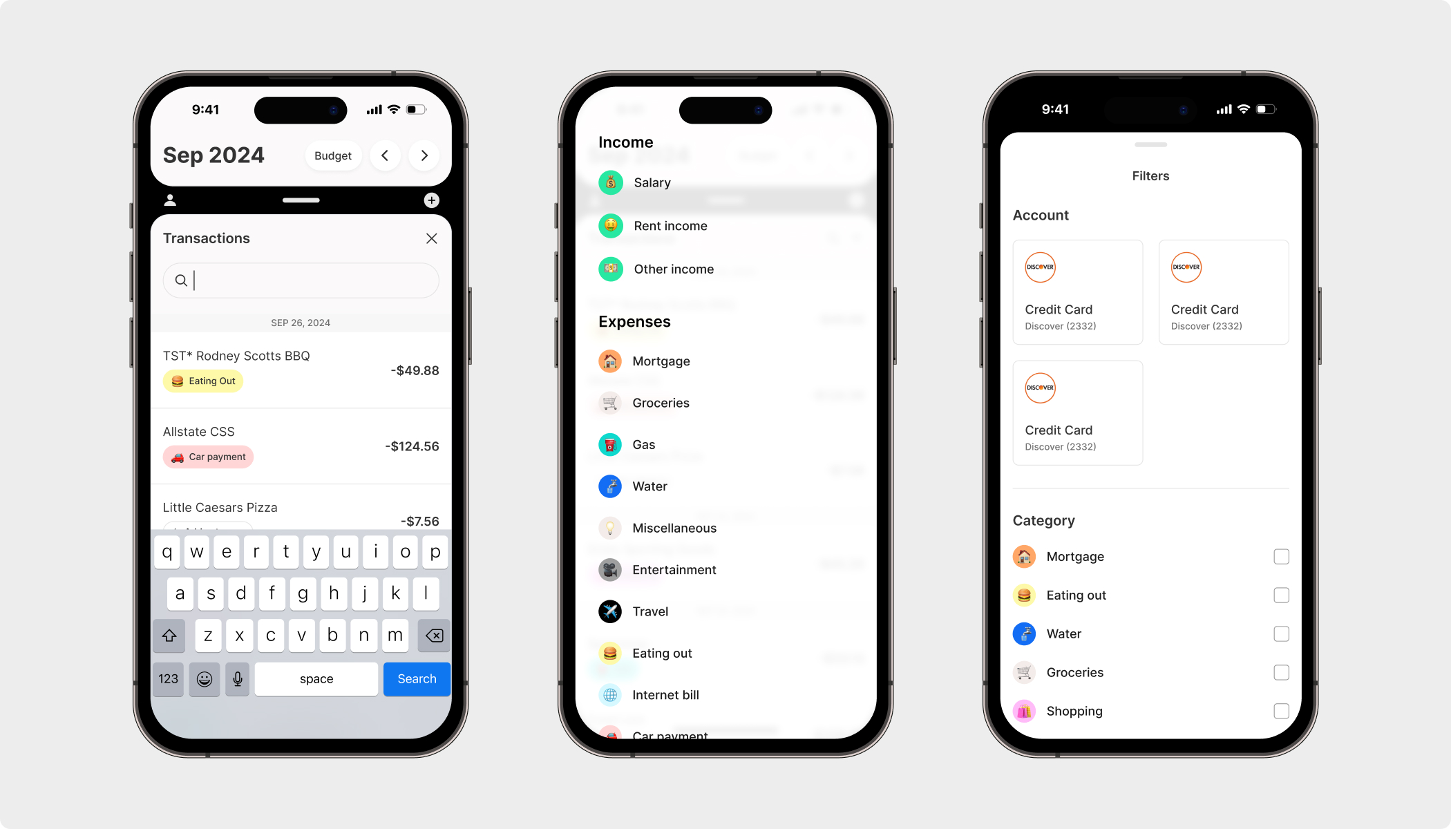
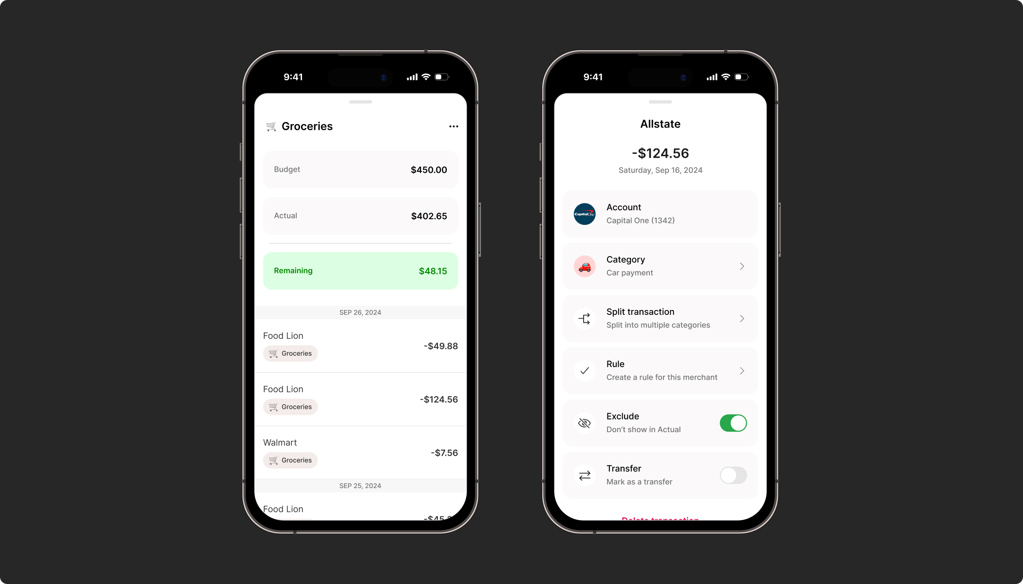
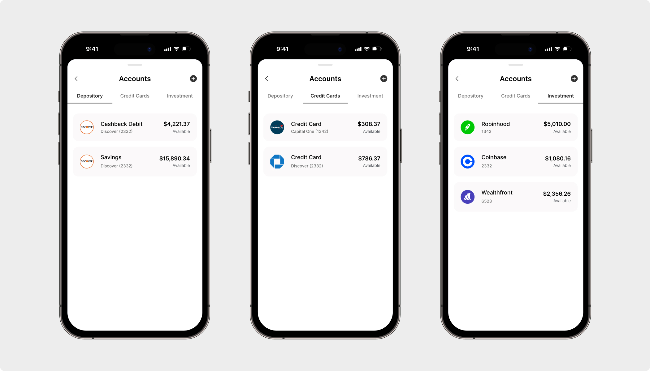
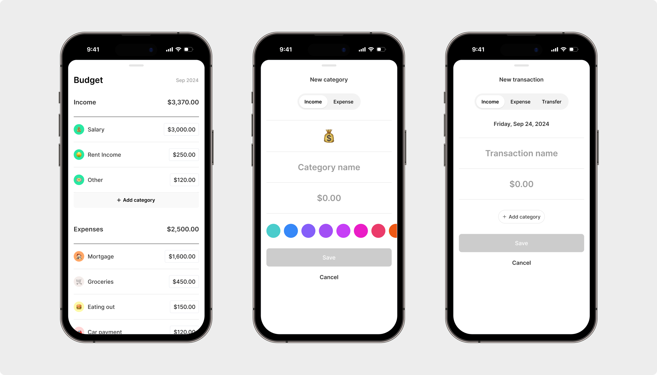
Lucra is an app with an alternative solution to budgeting and personal finance. Each financial situation is unique, so I prioritized customizability and a simple user experience in the design. Lucra provides users with data that changes and influences financial behavior. Taking a tactical approach, I designed the entire app architecture and design system.
According to a Credit Donkey study, only 32% of American households follow a budget. The reasons most people don’t follow a budget are a lack of education, desire, and time. Our goal was to build a system that educates users about good budgeting practices, encourages them to become passionate about their money, and provides them with personalized and comprehensible data.
My process
To begin, I sought to understand what the users’ pain points with current apps were in order to improve upon them. I conducted interviews with current customers of Mint, Copilot, Monarch Money, and EveryDollar, to discover what their issues were with their current method of tracking. Through these interviews, I discovered 5 major themes that are important to users:
- Simple – Users need a simpler interface. Current apps are overloaded with unnecessary details.
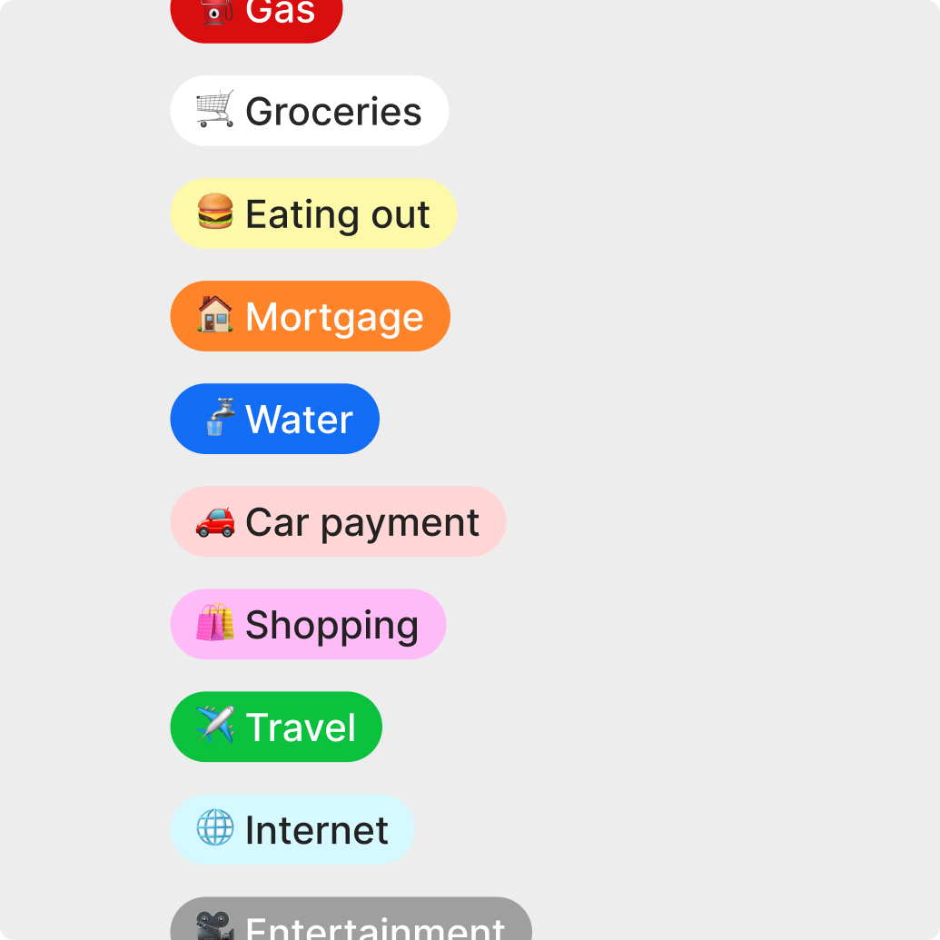
- Customizable – Current apps make too many assumptions in terms of atomization. The users want to control what functions are automated for them versus the ones that aren’t.
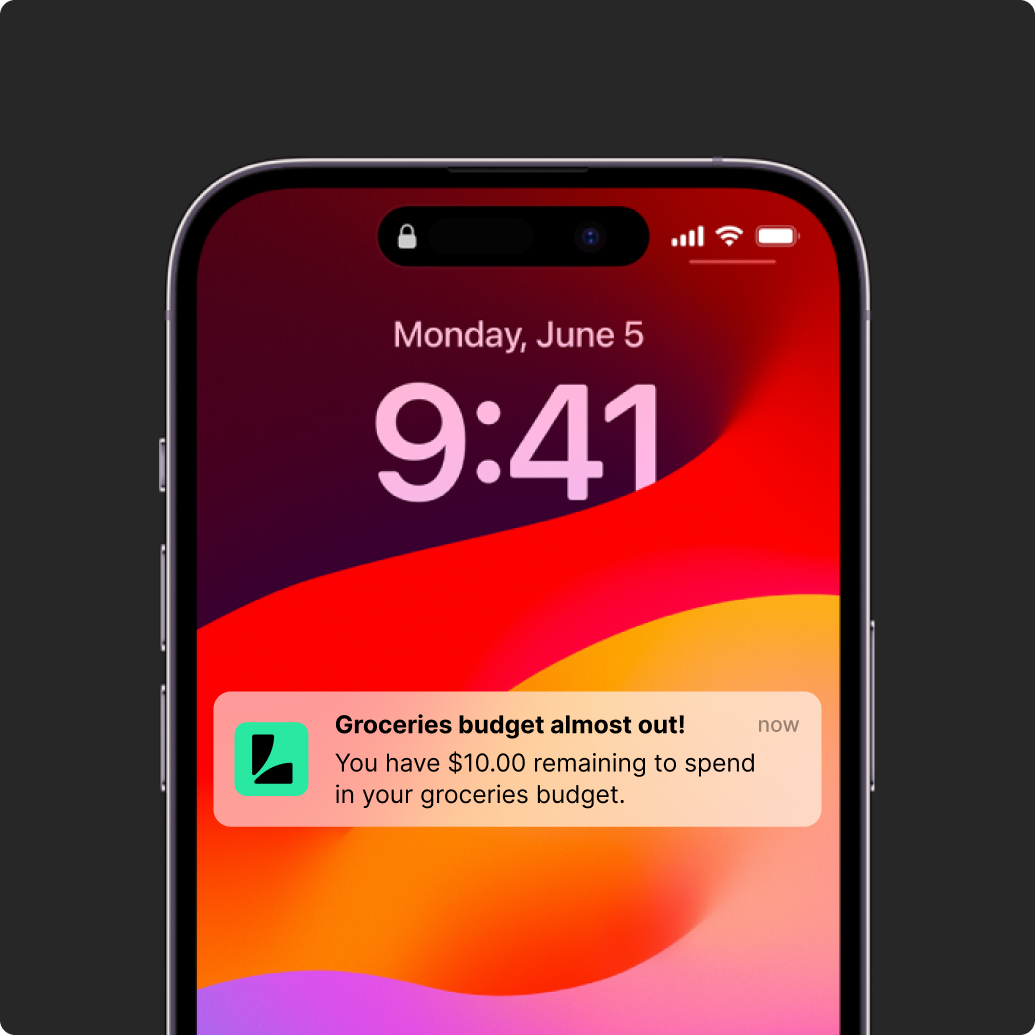
- Proactive – Most apps are reactive. Users wanted something that is proactive in order to actually influence financial behavior.
- Secure – Having their information stored safely was a high level priority.
- Efficient – People are busy. They need something that provides them with all necessary information quickly.
Empathizing with the users and their pain points helped me to create a better system.
The solution
After gathering market insight, I created a user journey and mapped out basic wireframes. From those wireframes, I built a prototyped version of Lucra for user testing. I thoughtfully considered a wide variety of people to test the app. Old, young, male, female, wise with money, inexperienced with money etc. After 3 months of testing, we had gathered enough data to begin making revisions. Out of those revisions from the beta testing came our current MVP.
Lucra – A simplified budgeting and finance tool that incites real behavioral change.

Hi I’m Chandler 👋
My experience in product and brand design helps me to solve complex problems, tell interesting stories, and create compelling experiences.
When I am not designing, you can catch me on my mountain bike shredding intense peaks, or in the salty sea surfing mediocre waves.
